For this project, I initiated the design process by developing a high-level information architecture and user flows. To further refine my designs, I created low-fidelity prototypes and tested them with users. Once I had incorporated their feedback and was satisfied with the designs, I moved on to creating high-fidelity designs for the specific screens.
To support future development, I also developed a custom pattern library for the product, which can be scaled into additional components as needed.
Below are some examples that showcase my work and the journey I took to complete the design of this product, starting from the initial conceptualisation to the final design outcome.


Primary objective for this project was to ensure a consistent and seamless user experience across the entire range of data visualisation products. To achieve this, we needed to develop a customised pattern library of components and establish a collaborative process for design and development.
After careful consideration, we decided to implement the Atomic Design methodology and create a comprehensive Design System, which proved to be an ideal solution. Project started by conducting an audit of the product portfolio, followed by the selection of appropriate technologies and designing a holistic user experience. Subsequently, a workflow for the creation of new components was defined and the maintenance of existing elements.
As a result, we successfully achieved the desired outcome of unifying our products, enabling faster delivery of new solutions and fostering stronger collaboration between our development and design team.
I this project I was fully responsible for UX and UI Design.


To begin this project, I first created a draft of the information architecture. This served as the foundation for developing wireframes for both the desktop and mobile versions of the website. After determining the appropriate placement and low-fidelity layout, I then created prototypes to test and ensure usability.
With the preliminary design completed, I proceeded to create high-fidelity versions for both desktop and mobile versions of the website. Additionally, I developed custom visual elements such as visual identity, icons, and illustrations to further enhance the design.
Throughout the design process, I carefully verified and iterated on each element to ensure the best possible outcome. Once all designs were finalised and approved, I handed them off for development.


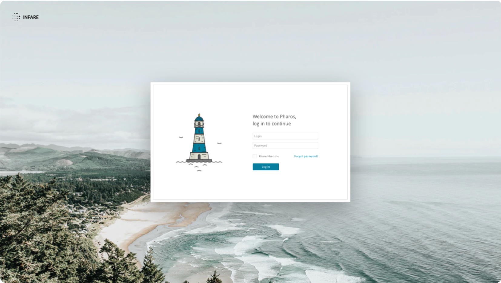
Approach to this project began with a thorough review of the already gathered documentation and requirements, allowing me to gain a comprehensive understanding of the client's needs. We then set out to design and develop a platform that would enable advisors to handle multiple portfolios for their clients, review and update them on a daily basis, and share them with clients.
One of my key goals was to ensure that the platform was easy to use and intuitive for both advisors and clients. I also wanted to ensure that the platform was customisable and adaptable to the needs of individual advisors.
Although there was no initial plan to synchronise the platform with digital crypto wallets, I made sure to build the platform in a way that allows for this functionality to be added in the future, as the client's needs evolve.


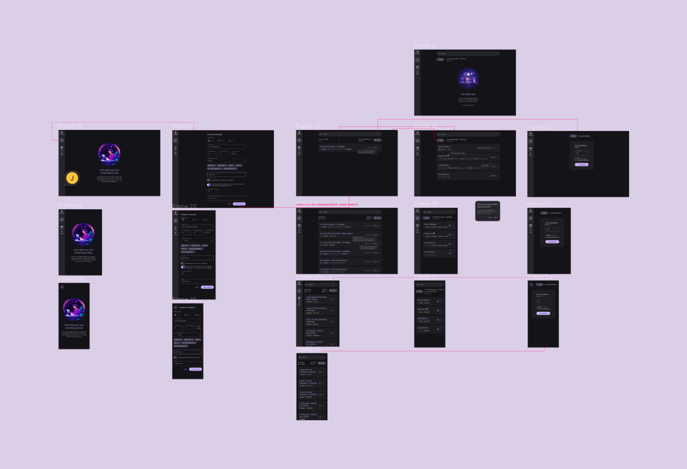
In Screenify, we began by defining a problem: recruiters often struggle to validate the expertise of specialists, which can lead to wasted resources and missed opportunities.
To address this challenge, I conducted a workshop to explore potential solutions. Ultimately, we decided to develop a screening tool. With this tool, recruiters define the specific skills they are seeking and the screening size. This allows them to efficiently verify their candidates' skillsets and make more data-driven decisions. We also decided, that whole tool will be developed with Material Design Pattern Library.
In this project, I'm responsible for UX/UI Design, Research, Visual Identity, and website development with Webflow.